This concludes the Gentlemen Prefer Red Series. I can't find #4 so I must have mailed it off without scanning it. I think I know who I sent it to and I will try and get it scanned after it arrives. I love how mica sheets add to the composition of each one #5 through #8. I belong to the NW Collage Society and at our June meeting we have been tasked with creating a black and white plus one postcard for our group competition. I thought I might recreate number 8 in red, black and white. It is almost there as is and I especially like the composition....maybe a few tweaks are needed.
 |
| Gentlemen Prefer Red #5 |
 |
| Gentlemen Prefer Red #6 |
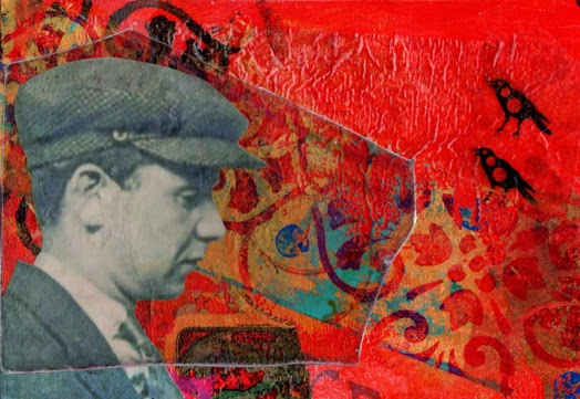 |
| Gentlemen Prefer Red # 7 |
 |
| Gentlemen Prefer Red #8 |

6 comments:
These are all so cool. I agree, No. 8 is superb!
Such a strong series John. The red is so vibrant and intense!
I find myself smiling when I study your work John!
I just marvel at your composition and the obvious joy you take in the process.
I love them all, but agree #8 is almost there al"RED"y! (sorry ;op)
Can you transfer onto the mica so you could offset it slightly? Just a thought. Looking forward to your next series already - you make a great success of them (but I still await the outcome of the seagull story...)
I love the whole series John and so happy to have one!! Thanks.
I love the series...and I am fortunate to own #6! My comment is late...but I have enjoyed the card since the day it arrived! Thank you!
Post a Comment