|
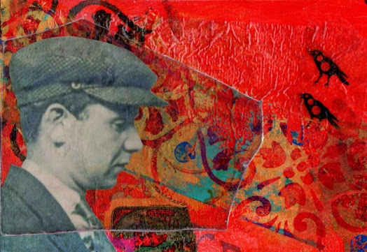
| Gentlemen Prefer Red #3 |
This week has been intense if not exhausting. I am commuting three hours a day round trip to take a class on Whidbey Island, Washington. That means driving, waiting, taking a ferry, and driving some more. I do get to enjoy being on the water and looking at the lovely island environment. Yesterday eagles were being attacked by the crows. It is nesting time. The fight for survival is on.
The workshop is also intense but wonderful. I can't even begin to create like Jesse Reno. It is his style. However, I am learning new painting techniques that I can use, hopefully, with my collage work. Today I am going to try and incorporate collage into what I have started in class to see if I can save it from disaster. If not, I have learned so much.
Gentlemen Prefer Red #3 is my way of creating in my style warming me up for the day. I have five more backgrounds to work with and hopefully will complete these postcards this weekend.